


Your website has excellent content, and even visitors spend time on it.
But you are not getting enough conversions.
What could be the reason?
Visitors know what you sell and how good your quality is. But are unaware of the next step. As per the psychological response, readers expect direction about what to do next. They anticipate it in terms of the context of your page.
For instance, you must have noticed the “Add to Cart” or “Order Now” button on a Product Page. Likewise, there is a “Sign Up” box on a Sign-Up page.
These buttons are called Call to Actions and help trigger the reader’s mind to act accordingly.
But there is more detail into it.
Try your best to write some compelling CTAs for more conversions. The selection of the right words, text, and colors can significantly impact the conversions.
Want to learn more about it? Continue Reading below
-
Write Concise, Clear, and Compelling CTAs
CTAs are a collection of two to five words. But they should be relevant and specific. Avoid vague CTAs that can confuse your readers. For instance, “Click Here” looks incomplete as it fails to inform the reader about the website’s message.
Check out the CTA of the below screenshot:
 Here, Unbounce reveals complete information that it is a trial, which is free.
Even if you are using verbs like Learn More, Shop Now, or Join Today, make sure to provide a relevant copy in the surrounding text. See this CTA of Kylie Cosmetics:
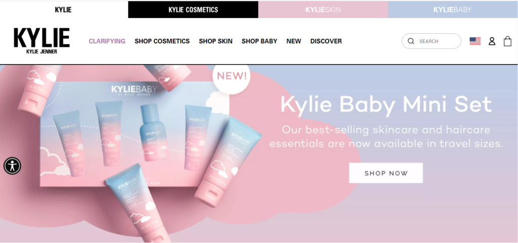 They have used supporting statements to make the readers understand what they mean. Besides this, their CTA is short and sounds compelling.
-
Consider the Design Element
Apart from selecting the right words, considering the design is essential. It can enhance the visual appearance of your CTA, thus making it look more attractive. You can do it by using appropriate colors, choosing the right font, and selecting the proper placement.
Color
Always pick a darker color than the main text, but it should relate to your site. For instance, the logo and CTAs can be of the same color. But, make sure that all CTAs of a single site are of the identical color.
Let us see the below example:

Here, The Canvas Prints have used a striking pink color that looks perfect in combination with a light background and blue text. The pink color makes the CTA stand out besides giving it some connection with the site.
White Space
It’s a good idea to leave some white space around the button. Neither text nor image should be very close to the CTA. Otherwise, it will make the reader focus more on the CTA than the text or the image. Besides this, it can make your page look neat and give users a good impression.
Shape
As far as the shape is concerned, keep the edges round. Our brains use less cognitive effort in looking at rounded pictures. So, ovals, rectangles with rounded edges, and circles can be the right option for a CTA.
But, having design skills is not mandatory. If you are writing a blog post, you can simply make your CTA stand out with the proper selection of color and text. Make it bold, increase the font, choose a great contrasting color, and you are done!
-
Combine CTAs with Visuals
Undoubtedly, all of us love visuals. So, using images for CTAs will be a wise decision. Many websites use CTAs over background images. Sometimes, they add a picture beside the CTA and even use GIFs.
These images help in grabbing the user’s attention. Placing a CTA beside or right after an image prompts the user to take quick action. But, make sure to put a high-quality image.
-
Show Sense of Urgency
CTAs play a vital role in convincing a visitor to make a purchase. They go along with a sales funnel. But they can perform this role in a better way. All you need is to show a sense of urgency. Adding a feel of urgency is also a proven tip for boosting website conversions.
Make the most of this technique by showing this impression through your CTAs. You can also integrate symbols, time, and numbers to divert users’ attention.
Some examples are mentioned below:
- Get flat 50% off today
- Avail free trial for 3 days
- Get 10% off on a premium plan
- Free consultation for 24 hours
-
Reveal User Benefit in CTAs
We, as humans, have a lust to get more and more benefits. That is why we do not prefer to spend our time on something from which we don’t get any advantage. The same is the case with CTAs.
If CTAs show a benefit to the visitor, they are more likely to click on them. For instance, a CTA button” Get a Free Trial” will provoke users to click on it. If it just says “Get a Trial,” users will never consider it. Therefore, incorporate benefits, deals, and discount offers in CTAs.
CTAs can make a Drastic Difference
I know you can’t wait to implement all of the above tips. Yes, they can make a big difference. And after learning the benefits of tweaking your CTAs, you must have realized where you were wrong. So, select some great action words, choose the best design, and make it distinctive with a fantastic image.
But, always remember to show the benefit aspect and a sense of urgency. After some practice, you can make great CTAs that drive huge conversions.
All the best!


")


